top of page

SANC BRAND DESIGN
SANC is an authentic soy sauce from South Korea. Fermented in a natural preserve and 24/7 classical music it is a unique and perfect alternative to salt in any recipe.
The focus of the rebrand was to engage with a younger audience and stand out to the traditional style of other competitors in Soy.


The initial version of the new brand logo featured a cartoon character that echoed the product's style, offering a bolder and more entertaining option. The character was depicted dropping salt from their hand to illustrate the reduced sodium levels.
FIRST DESIGN
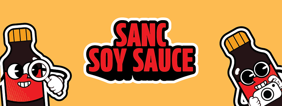
SECOND ITERATION

Following the new message of the brand "Flavor Bomb" and transportability, the second iteration and final design was adapted to show both motion and comedic unique feature to draw attention to the brand.


LOGO VARIANTS OF FIRST DESIGN


SOCIAL MEDIA APPLICATION


bottom of page